Mapping Climate Data
**The following guest post is by [Jeremy Wang](http://climatecode.org/activities/gsoc/2012-wang/), from the University of North Carolina**
Well-informed public debate around science seems nowhere more necessary – and hard to come by – than in the field of climate science. Finding clear and transparent ways to communicate climate data is thus an imperative aspect of the climate scientist’s work. However the skills of visualisation and development are not necessarily part of the scientists’ training – more collaboration is necessary to help make their findings truly public, which is what the [Climate Code Foundation](http://climatecode.org) have been trying to promote. As part of this summer’s [Google Summer of Code](http://www.google-melange.com/gsoc/homepage/google/gsoc2012), under the mentoring of the Climate Code Foundation, I helped complete a new project which aims to aid the communication of climate science through a user-friendly mapping system which visualises a range of datasets through time.

[CCF MapView](http://data.climatecode.org/gistemp-view) is an online map-based visualization of the [GISTEMP climate analysis](http://data.giss.nasa.gov/gistemp/) (NASA’s record of global surface temperature fluctuations going back to 1880), using the open-source implementation curated by the Climate Code Foundation, [ccc-gistemp](http://code.google.com/p/ccc-gistemp). The tool shows a Google Maps-like interface onto which various climate data is overlaid. Data visualized on the map is intended to describe the basic climate analysis performed by GISTEMP, from the level of individual weather stations through to the global averaging processes. Controversy around the interpretation of some datasets, in particular the Land Surface Air Temperature figures, makes it important to be clear and transparent about the various different indicators which are analysed and how the analysis is undertaken.

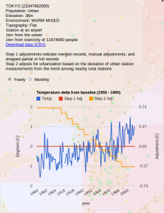
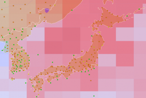
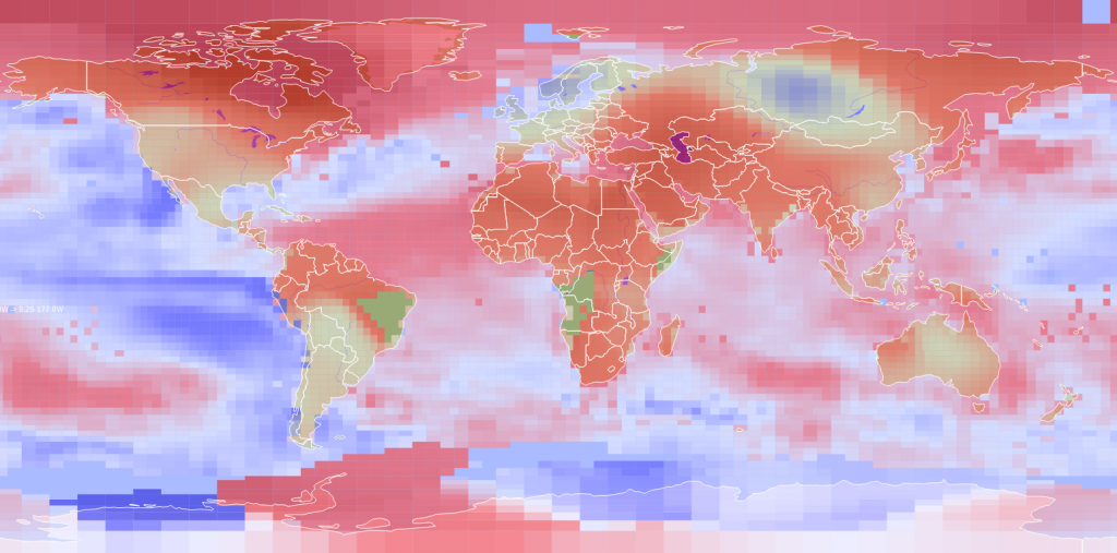
Weather stations contributing to the GISTEMP analysis are shown, with color indicating their level of urbanization (urban, suburban, or rural). Detailed information about each station can be displayed, including geographic information about the station location and charts showing the historical temperature record, including adjustments made based on partial/missing data and urbanization effect. The basic unit in the GISTEMP analysis is a grid of 8000 sub-boxes designed to contain equal surface area across the globe (although they appear uneven on a map). This grid is
overlaid on the map, with color indicating the relative temperature for each year. The map can be animated, showing the change in relative temperature from 1880 to the present. The map supports dynamic user interaction, including zooming and panning.
I hope this tool will help better explain and illustrate the GISTEMP climate analysis procedure and results, especially for non-scientists and those interested in climate change. For a more detailed description of the project or to download the source code, visit [the project page](http://code.google.com/p/ccf-mapview).

Leave a Reply